Posture Vélo
Visual identity for a physiotherapy and bike fitting service
- Timeline
- August 2026
- My role
- Designer
- Tech
- Figma • Affinity Design
The challenge
Posture Vélo works with everyone from people preparing for a cycling holiday to athletes training for a sporting challenge. The brand needed to feel clinical enough to signal professional care, yet clearly rooted in the world of cycling, and simple enough to stay consistent across platforms.
Inspiration
The starting point was the road itself, specifically the signs that guide cyclists through Europe’s cycling networks, from France’s véloroutes, the Dutch LF-routes and EuroVelo to the numbered-node network devised by Belgian engineer Hugo Bollen in 1995. These signs sit at a cyclist’s eye level and pair a bicycle pictogram with a route name or number, in flat colors that can be recognized at a glance without slowing down.
Their lettering was just as important. Traffic signs use semi-geometric typefaces drawn by engineers rather than type designers, with uniform strokes and rigid geometry. Yet that plain, functional character is exactly what has made them so memorable: seen daily at the roadside, typefaces such as DIN 1451, Highway Gothic and the French Caractères have left a lasting mark on our collective visual memory. From these sources I took four qualities for Posture Vélo: clarity, legibility in motion, a strict and repeatable kit, and the trust we place in official signage.
The visual identity
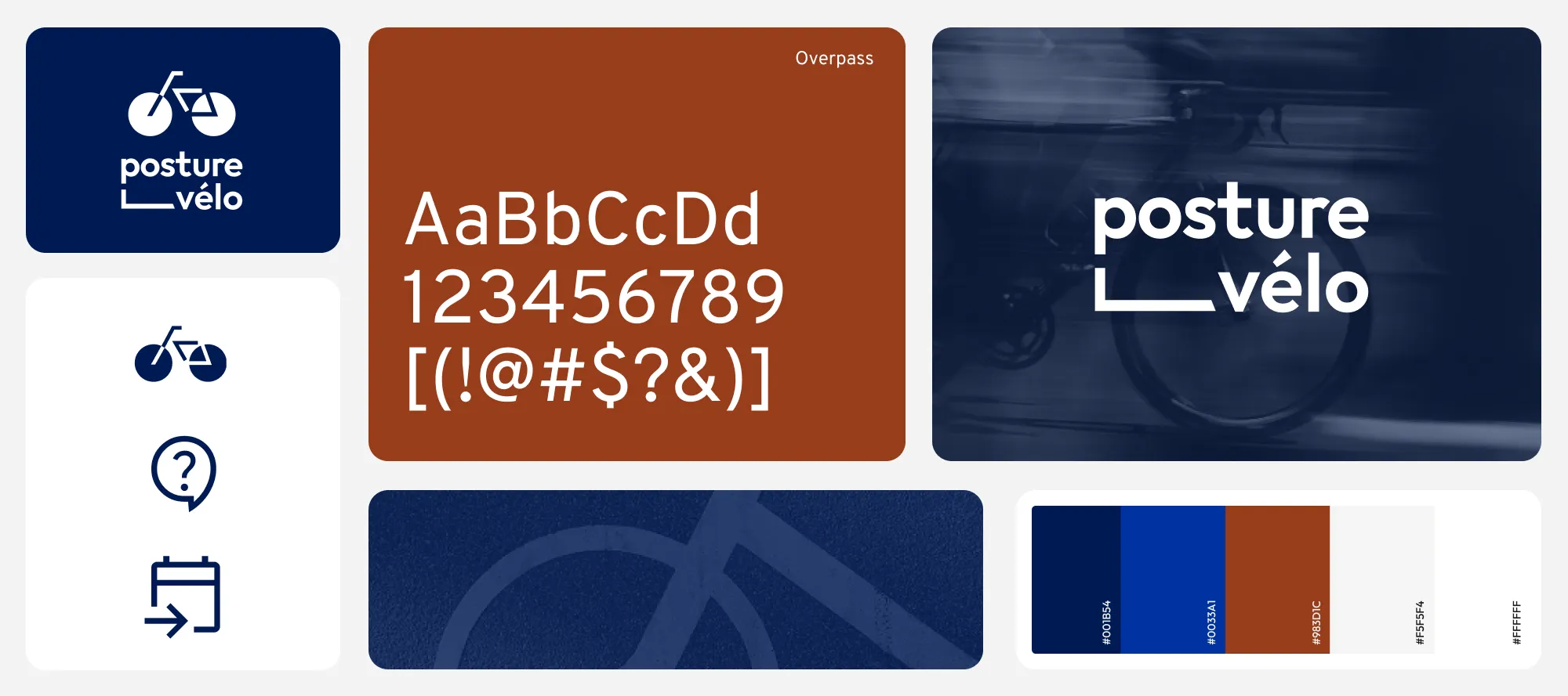
The identity is built directly from this signage language. The wordmark, based on a refined version of Outfit, is joined by an angled line that reads like a road marking, leading the eye from “posture” into “vélo”. A deep blue taken from French road signs anchors the palette, while Barlow Condensed and Overpass, both close relatives of road sign lettering, carry the same functional voice into the typography. A small set of single-color pictograms completes the system, often set inside circles that echo the node markers of the cycling networks.
In use
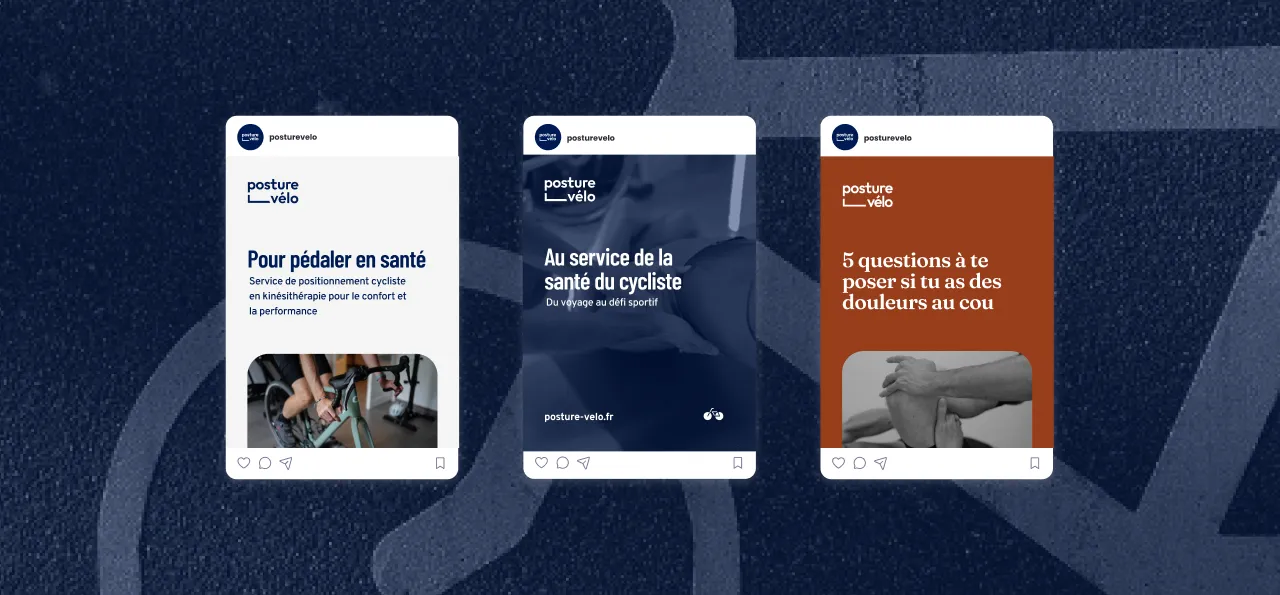
On social media, the system needs only a few elements: the logo, a short headline in Barlow Condensed and a single photograph or flat field of deep blue. Every post reads quickly and consistently, just like a sign by the roadside.
Reflections
The result is a compact, coherent identity in which every element traces back to a single idea: the clear, trustworthy language of cycling road signs. The brand guidelines document the full system so Posture Vélo can apply it consistently on its own across print, web and social media.